|
|
Post by De$ertW0lfo1 on Sept 8, 2007 8:55:44 GMT -5
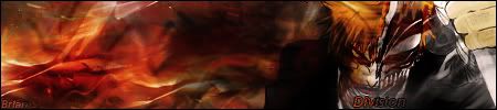
Heres my most recent sig i made...  What you guys think?... thx  ;D |
|
|
|
Post by Brian Silver on Sept 8, 2007 9:29:55 GMT -5
Using some of the same styles, but its still good |
|
|
|
Post by De$ertW0lfo1 on Sept 8, 2007 9:35:59 GMT -5
yeah i know, i need to find the time to try some new things thx  |
|
|
|
Post by aoeclald on Sept 8, 2007 12:07:44 GMT -5
Wow, really nice. The text is a little hard to find, I'd put some effects around it to draw attention (but not a lot! You've got the hang of text, now focus on adding effects  Also, I'd start to blur parts of background, especially in this one, because it will help get rid of some of the pixelly look and will also give the illusion of depth. To do that... New Layer -> Image -> Apply Image... -> Ok. Then take you blur took and start blurring places in the background that are just "there". Particularly the left part of this sig and the bottom right. Then take your sharpen tool and maybe do some low strength brushing on his face and the white to the right. Then Filter -> Noise -> Despeckle. Also, you can start using Burn/Dodge tools to increase brightness (Dodge) and darken shadows (Burn) as well as a few other helpful things... I'd start exploring with those tools, now. Other than that, great job! I'm awaiting a V2  --- Although it is the same style as previous sigs, this one is your best in the style. Hence why I'm giving you new tools to start using to further advance your signatures ^_^ |
|
|
|
Post by De$ertW0lfo1 on Sept 8, 2007 17:29:17 GMT -5
thx man! i will try that l8er |
|